EDITOR’S NOTE: This essay is reprinted here with the gracious permission of both the author and Architect magazine, the journal of the American Institute of Architects, where it first appeared.
The Philharmonie de Paris, a new concert hall designed by Jean Nouvel, Hon. FAIA, opened last year. While the construction was costly and the remote location at the northeastern edge of the city remains controversial, the hall has received plaudits for its musical ambience. “From first impressions it seems acoustically marvelous,” wrote Anthony Tommasini of The New York Times. Alex Ross of the New Yorker found the sound to be “rather wonderful,” although he characterized the building itself as a “menacing presence.” The Guardian’s architecture critic, Oliver Wainwright, went further and described the exterior as “a tyrannical hulk of a thing.” Tyrannical or not, a concert hall conceived as a “thing” – a freestanding object – is pretty much par for the course these days.
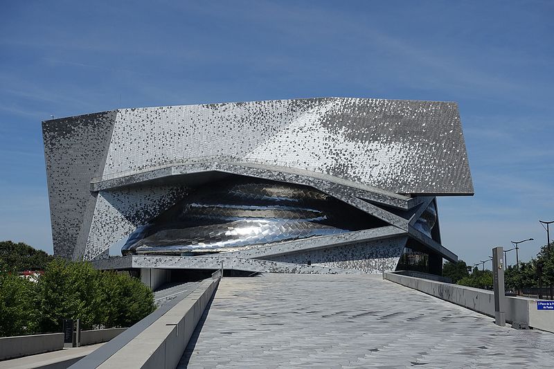
The freestanding concert hall, in a plaza, on a waterfront, or in a park (the Philharmonie sits in the Parc de la Villette), sends the unmistakable message that culture is a thing apart. Today, when all urban concert halls aspire to be iconic landmarks, it’s easy to forget that they used to be designed quite differently.
PART OF THE URBAN FABRIC
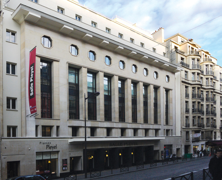
The $505 million Philharmonie replaces the Salle Pleyel as Paris’ chief orchestral hall. The Salle, which was built by the renowned French piano maker Pleyel et Cie in 1927, was designed by Jacques Marcel Auburtin, André Granet, and Jean-Baptiste Mathon. The building sits on the Rue du Faubourg Saint-Honoré in the fashionable 8th Arrondissement. The flat façade is cheek by jowl with the flanking apartment buildings and is distinguished chiefly by the different scale of its fenestration, its Art Deco detailing, and the bare hint of a marquee. The front of the building contains practice rooms and penthouse apartments; the 3,000-seat hall is located at the rear of the building, deep inside the city block. There was nothing unusual about this arrangement of lobby on the street, auditorium behind: Broadway theaters traditionally used a similar solution, as did the early movie palaces.
Integrating a concert hall into the urban fabric by hiding it goes back to the 19th century. In 1899, the distinguished architect Thomas Edward Collcutt, who was responsible for D’Oyly Carte’s Royal English Opera House, designed Bechstein Hall in London’s West End for the famous German piano maker C. Bechstein. The four-story Renaissance Revival façade, with its bay windows and central gable, has a similar scale to its neighbors. This is possible because the 545-seat hall is tucked into the rear of the lot, with service access from a back lane. Renamed Wigmore Hall, this concert venue remains one of the best small halls in Europe.
Urban theaters and opera houses have a long history, but the concert hall is a relative newcomer. Civic symphony orchestras were organized at the end of the 18th century, and about a hundred years later purpose-built concert halls started appearing: Leipzig’s Gewandhaus, Vienna’s Musikverein, and Amsterdam’s Royal Concertgebouw. These large buildings were a distinctive presence, but their architects went to great lengths to integrate them into their urban surroundings. The halls followed building lines, hugged the sidewalk, avoided unseemly blank walls, and deployed an array of conventional architectural devices – arches, columns, pilasters, windows, balustrades – to soften the impact of the bulky auditoriums.
American halls of the 19th century were similarly integrated into the city. Chickering Hall in New York, built in 1875 by the Boston-based piano maker Chickering & Sons, stood on Fifth Avenue at West 18th Street. Designed by George B. Post and considered one of the architect’s best works, the brick-and-brownstone pile contained showrooms on the ground floor and signaled the presence of its 1,450-seat hall with a set of tall arches, glazed on the front and blank on the side. It was impressive but not out of place among the mansions which then lined Fifth Avenue. Chickering was soon superseded by the much larger Carnegie Hall (whose largest auditorium has 2,800 seats), designed by William Burnet Tuthill in 1891. Like Chickering, Carnegie Hall was designed to completely fill its corner lot, fitting in rather than standing out.
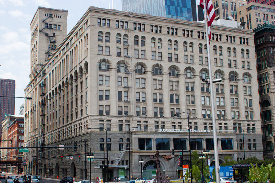
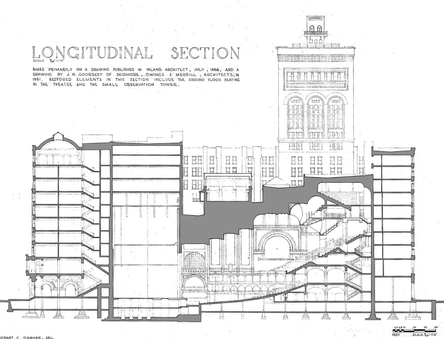
Another way to successfully integrate a bulky building into the smaller-scale fabric of a city street was to wrap it in something else. That is what Dankmar Adler and Louis Sullivan did in 1889 when they designed Chicago’s Auditorium Building. The 10-story structure occupied an entire city block. The huge hall, which was originally intended for opera, was buried behind a hotel and an office building.
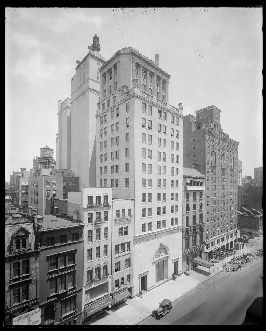
Whitney Warren and Charles Wetmore adopted a similar strategy in 1925 when they designed Steinway Hall, another piano maker’s hall. Across the street from Carnegie Hall, the narrow frontage on West 57th Street is given distinction by a three-story limestone base with a frieze containing portrait medallions of great pianist-composers including Beethoven, Chopin, and Liszt. The Steinway & Sons showrooms were on the ground floor (Steinway moved out in 2014); the 250-seat hall was on the second floor, and the upper nine floors were rented offices.
Combining a concert hall with commercial space, as was the case with both the Auditorium Building and Steinway Hall, is a strategy that might benefit financially strapped orchestras today. Instead of sinking money into iconic buildings, whose aim – not always successful – is to catch the attention of big donors and the public, it might be wiser to exploit prominent downtown locations by using air rights for income-generating uses.
FORM FOLLOWING FUNCTION
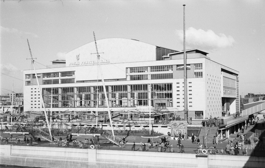
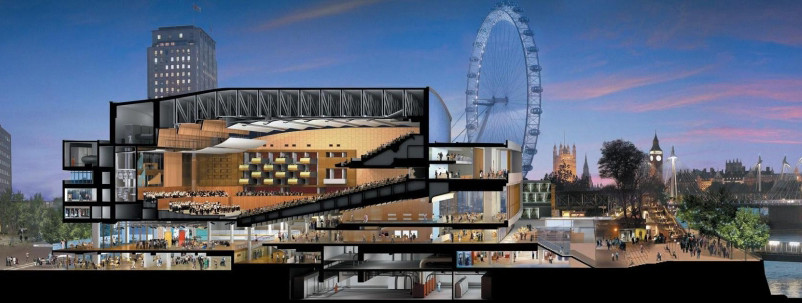
The first generation of prominent postwar concert halls, such as Robert Matthew’s Royal Festival Hall, in London (1951), Max Abramovitz’s Philharmonic Hall at Lincoln Center (1962), and Hans Scharoun’s Berliner Philharmonie (1963), set the pattern for future halls: freestanding object buildings surrounded by open space. The reason had less to do with the size of the hall – Chicago’s 4,300-seat Auditorium is larger than all but a handful of modern halls – than with the desire to have form follow function. Because the most important functional component of a concert hall is the auditorium, that needed to be expressed on the exterior. Most modern concert halls were windowless, so this formal strategy produced boxy or fan-shaped buildings with lots of blank walls. Later architects attempted to mitigate the deadening effect by adding colonnades (Lincoln Center), wrapping the hall in swoopy shapes (Disney Hall), or treating the surfaces (the Philharmonie is decorated with an Escher-like bird pattern). But a mammoth freestanding concert hall remains overwhelming at best, “menacing” at worst.
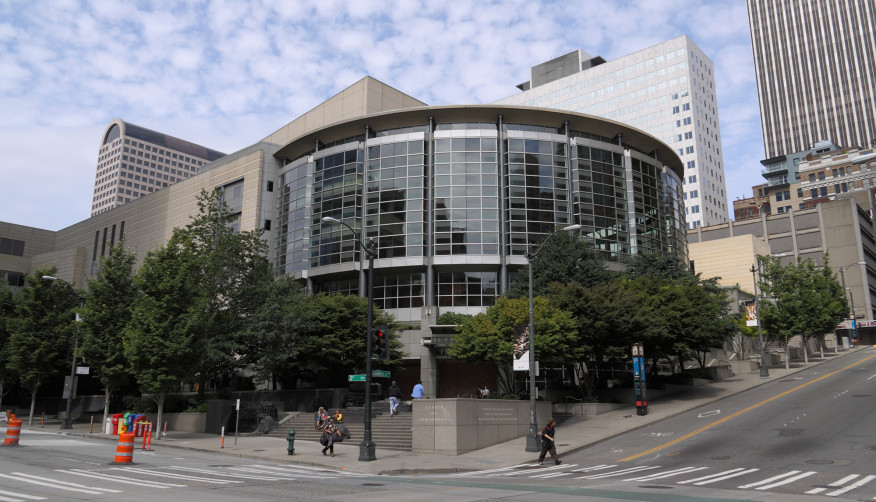
Recent examples of urban concert halls that are integrated into the urban fabric are few and far between. Benaroya Hall (1998), designed by LMN Architects, occupies a city block and is a low-key presence in downtown Seattle. Perhaps too low-key. After praising the acoustics and ambiance of the hall itself, New York Times music critic Bernard Holland characterized the exterior of the building as “functional to a fault,” as if the architecture “didn’t want to be noticed at all.” The building has a lot of glass, but there is nothing here that communicates, or celebrates, making and listening to music.
No one could miss the musical reference in the Nancy Lee and Perry R. Bass Performance Hall, in Fort Worth, Texas: Two 48-foot-high heralding angels sculpted out of limestone adorn the façade. Because the building is shoehorned into one of the city’s tiny (200-foot-square) blocks, the angels’ gold-leafed trumpets extend over the sidewalk. The 2,500-seat hall fits snugly into the fine-grained grid of downtown Fort Worth; like an old-time downtown department store, it has its entrances at the corners. The highly modeled architectural style, unexpectedly influenced by the Viennese Secession, allows architect David M. Schwarz, AIA, to break down the scale of what might otherwise appear a lumpish building. The auditorium is shrouded on three sides by lobbies and dressing rooms, and it is only in the rear that the blank wall of the stage tower is apparent.

Making a concert hall effectively invisible has several advantages. Not only does hiding the hall solve the problem of how to fit a massive building into a dense urban fabric, a hidden auditorium can be designed with full consideration for acoustics and sight lines, knowing that the form will not have an impact on exterior appearance. Perhaps the chief plus is that the concert hall can become a part of everyday city life, rather than existing in splendid isolation on the architectural equivalent of a cultural pedestal. At a time when symphony orchestras seek to find a new and younger audience, that might be the biggest benefit of all.
