EDITOR’S NOTE: This essay is reprinted here with the gracious permission of both the author and Architect magazine, the journal of the American Institute of Architects, where it first appeared.
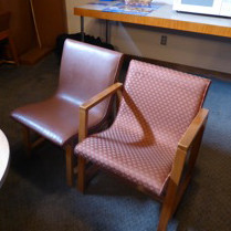
I first became aware of the Kleinhans Music Hall in Buffalo because of a chair. I was researching Eero Saarinen’s furniture for my book Now I Sit Me Down (Farrar, Straus, and Giroux, 2016), and I came across one of his earliest chairs, designed in the late 1930s in collaboration with Charles Eames. The two young men – Saarinen was 28, Eames was 31 – were working together in the Bloomfield Hills, Mich., office of Saarinen & Saarinen, a partnership recently formed by Eliel Saarinen and his son. The chair was intended for a new concert hall that the firm was designing in Buffalo.
I was recently in Buffalo and had a chance to visit the hall. Not surprisingly, the chair was no longer in use – few public seats last 75 years. Nevertheless, I found several survivors in the musicians’ lounge. The striking design, which uses one piece of lightly padded, molded plywood for the seat and back, was obviously influenced by Alvar Aalto’s molded wood furniture of that period, yet for two novices it remains an impressive accomplishment.
I came to Kleinhans for the chair, but I stayed for the architecture. Not widely known, this building, which opened in 1940, is remarkable in several ways. To begin with, unlike most urban concert halls, it is not downtown but in a leafy residential neighborhood, surrounded by large, freestanding homes on Buffalo’s West Side. The hall faces a 500-foot-diameter, landscaped circle that is the prominent termination of one of the parkways that Frederick Law Olmsted and Calvert Vaux laid out when they re-planned the city in the 1860s; the other end of the parkway is anchored by H. H. Richardson’s monumental Buffalo State Hospital.
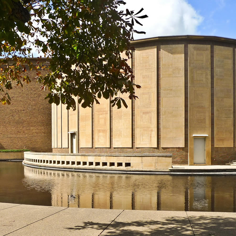
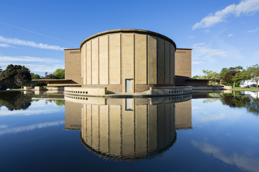
Olmsted and Vaux’s circle is the key to the Kleinhans partis: a drumlike curved chamber music hall echoes the circular shape; the main hall, a larger curved volume, extends to the rear; the lobby, serving both halls, is situated between. Nothing could be simpler.
An Understated Throwback
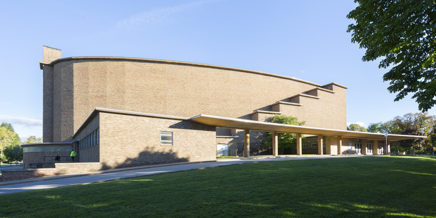
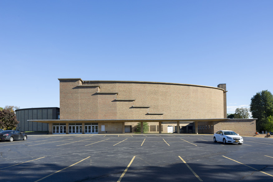
We have become used to concert halls that make big bold statements: the looming sculptural forms of the Philharmonie in Paris, the metallic sails of Disney Hall in Los Angeles, the giant glass barrel vault of the Kimmel Center for Performing Arts in Philadelphia. The Kleinhans is curiously elusive. Approaching from the circle, one catches glimpses between the trees of a small drum embraced by a curved walkway and a reflecting pool. No windows and no entrances – there are two in this axially symmetrical building – are visible, just the drum and the pool. The main entrance is on the side, and it is a bit of a surprise since it is dominated by a long concrete canopy that, while structurally elegant, resembles a bus shelter. Mundane but useful; it was raining hard the day I visited, and I thankfully ducked under its protective cover.
The exterior of the Kleinhans is brick. No structural high jinks, no fancy coursework, just multicolored Ohio Wyandotte brick, a rather rustic material that Eliel Saarinen had used extensively at the Cranbrook School in Michigan. A bulky, windowless, brick building sounds like an awkward fit in a residential setting, yet fit it does. The scale of the large hall is reduced by stepping-down emergency stairs that anticipate the exterior stair in Aalto’s Baker House; the walls of the chamber music hall – the drum – are enlivened by large panels of buff Mankato limestone. The regular spaces between the panels resemble pilasters and, combined with the reflecting pool, suggest a classical rotunda. Think Pope’s Jefferson Memorial.
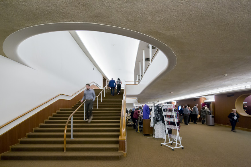
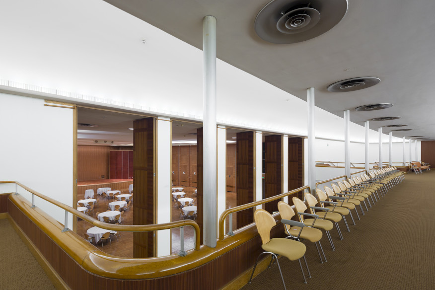
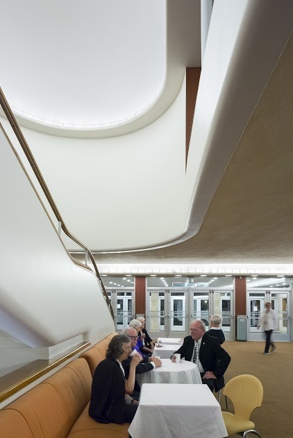
Inside, the lobby is a 50-foot-wide arced space with curved walls, rounded details, and sinuous stairs leading down to a restaurant and bar in the basement, and up to the second-level lobby. This upper gallery is suspended by steel hangers from the ceiling, leaving the lower lobby column-free. My guide, Ted Lownie, of the local firm HHL Architects, has served as Kleinhans’s house architect for two decades, and he speculates that while the exterior shows Eliel’s hand, the lobby seems to be Eero’s work. Just before joining his father, the younger Saarinen worked for Norman Bel Geddes, the industrial designer responsible for tear-drop-shaped cars, swooshy desk lamps, and curvaceous exhibition pavilions. Bel Geddes is considered to be one of the fathers of streamlining, and his influence on the Kleinhans lobby is unmistakable. It’s even apparent in the rounded upholstery of the lobby seating, designed by Eero and Charles.
On one side of the lobby, five full-height wooden doors swing open to reveal the chamber music hall. The walls of the hall, like the doors, are zebrawood, and curved rosewood screens flank the raised stage; the floor is oak and the molded ceiling is white plaster. The decor, as in the lobby, is modernist, but unlike so many buildings today, it is neither over-detailed nor merely celebrates precision. Lighting fixtures are mostly hidden, and the space is illuminated by recessed wall spots that reflect light off the rippled ceiling. Technology is kept in the background; you could call this Low Tech.
“A Joy to Play In”
The ultimate test of a concert hall is the main auditorium. The acoustics of Kleinhans are somewhat controversial, because the reverberation time is relatively short, which today is considered suboptimal by many acousticians. On the other hand, musicians have generally praised the hall. Sergei Rachmaninoff, who performed in Kleinhans shortly after it opened, considered it “one of the best acoustical arrangements in this country.” The violin virtuoso Jascha Heifetz called it “a joy to play in.” I attended a Joshua Bell concert during my visit and to me the music sounded clear and precise.
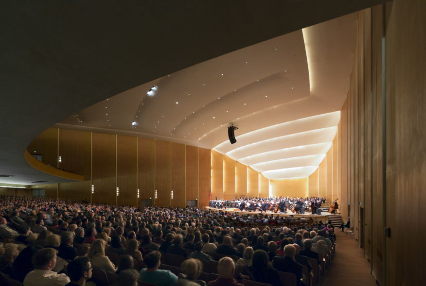
But perhaps I was influenced by the architecture. It’s rare that a room takes one’s breath away – this one does. There is none of the distracting techno-clutter that you find in so many modern concert halls; no suspended sound reflectors and chandeliers, no banks of spotlights, no sculptural wall treatment. The softly modeled plaster ceiling and the subtly shaped wooden walls lead the eye to the stage. There is no proscenium to separate the audience from the musicians. We are all together in this serene space.
Eliel Saarinen was close to music – and to musicians. In Finland he had known Jean Sibelius and Gustav Mahler, and he was friends with Serge Koussevitzky, the conductor of the Boston Symphony Orchestra. Koussevitzky, who recommended Saarinen for the Kleinhans job, had commissioned him in 1937 to plan the orchestra’s summer home at Tanglewood in western Massachusetts. As he did in the Tanglewood “Shed,” Saarinen used a fan-shape for Kleinhans, which is a very large hall – the original capacity was 2,800, recently reduced to 2,400 to provide more comfortable seating. But because of its shape all the seats in the steeply raked auditorium, and on the large balcony, are close to the stage. Significantly, new seating and carpeting – both matching the original – are the only notable changes to the hall in 75 years.
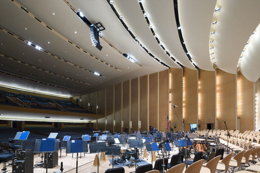
An impression of warm intimacy is heightened by the light-colored wood paneling – primavera, the same wood that Mies would use in the Farnsworth House. The paneling is better described as wallpaper, because it is actually a paper-thin wood veneer on a linen backing that is glued to the plaster wall. Randomly spaced sound-absorbing panels are faced with perforated sheets of asbestos-cement, painted to look like primavera. Not form follows function, but form follows the demands of the human eye.
Because Eero Saarinen went on to become famous and is today better remembered than his father, there is a tendency to emphasize his involvement and, indeed, the streamlined lobby does anticipate his TWA terminal. But Kleinhans shows all the marks of a mature and seasoned designer, and while Eero was undoubtedly precocious, he was only four years out of school when he started on the building. At Kleinhans, Saarinen père took the lead. “Until his death, I worked in the form of my father,” Eero later explained in an interview.
Saarinen’s Humanism
Kleinhans was Eliel Saarinen’s first major American commission outside Cranbrook. By the time that the concert hall was designed he had moved away from the decorative Modernism of his earlier buildings, but the textured brick, the tapestry-like stone panels, the “quilted” wood paneling, even the use of symmetry, mark Kleinhans as a outlier to the then-recently christened International Style. (Henry-Russell Hitchcock and Philip Johnson had pointedly left Eliel Saarinen out of their International Style exhibition at the Museum of Modern Art in the early 1930s.) During the following postwar years, as architecture moved in a determinedly functionalist direction, Eliel Saarinen’s brand of Modernism would come to seem passé. More’s the pity.
While Klienhans includes some Art Moderne touches, and its lobby shows the influence of the then-current fashion for streamlining, its privileging of the tactile and the visual reflects Eliel’s considered humanism. In his book Search for Form (Reinhold, 1948), he wrote, “the reasons for strength and weakness of form cannot be found in the turmoil of life, but in man himself.” Not that Kleinhans ignores the “turmoil of life” – this is a technically advanced building. The spaces are fully air-conditioned; deep steel trusses span the concert hall; hidden I-beams support the hovering cantilever of the balcony; a large portion of the stage acts as an elevator and lowers to accommodate extra seating or an orchestra pit. Yet Saarinen never allows his technological legerdemain to intrude on the musical experience of the hall. That’s part of his humanism, too.
